blog
B2B marketers are adopting exciting new color palettes
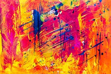
The world of visual design in B2B Marketing has been going through a quiet revolution. More and more B2B marketers are exploring really exciting color palettes in their visual identity. Gone are the days of staid blues, and blacks, and neutral colors. Say hello to bright pink, and orange, and purples, and gradients!
So how did we get here?
Step 1: Mobile Phones Transform Consumer UX Design
The revolution in B2B design probably started with Apple’s products, especially the iPhone, with clean design lines and wonderfully attention to detail. Google followed with the creation of “material design” with its simplified design vocabulary. The trend soon spread to other mobile consumer apps and websites. In fact, the success of companies like Pinterest and Instagram can be directly attributed to their focus on clean and exciting UX design.
Step 2: B2B UX Design Expectations Shift
The mobile boom forced B2B products to create mobile versions of their apps. And, they had to play with a different set of UX and design rules. They had to create apps that existed adjacent to beautifully crafted consumer apps. B2B designers quickly followed suit and suddenly the UX Designer was the most sought after role in B2B marketing design teams.
Step 3: UX Changes lead to New and More Open Design Options
As B2B designers learnt UX designs from their consumer counterparts, it is not hard to see how that led to the final transformative change: the arrival of the UX designer in B2B product teams opened up the world of design to B2B marketers. They realized how narrow and strait-jacketed their designs had been for years. They adopted a much greater variety of colors and a much larger design palette.
Here are some representative samples of companies that have really adopted exciting visual themes:
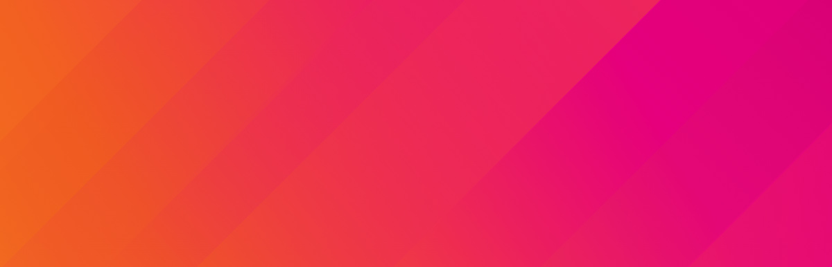
- Splunk: great use of colors and gradients for a distinctly technical space: Data Management. Notice the use of gradients and a cornucopia of bright colors
- SentinelOne: Go back a decade or so ago, and every security company was black or red or white all over. How refreshing to see a totally different set of colors from this deeply technical security Unicorn
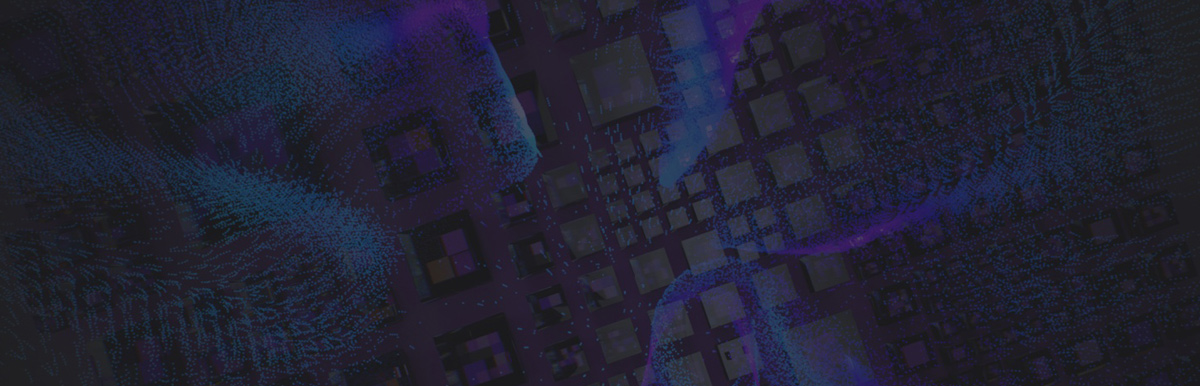
- ThoughSpot: this one just caught our eye. Is there anything more psychedelic than the images being used to introduce the ThoughtSpot Cloud
If these hard-core technology B2B companies can explore such exciting visual landscapes, it bodes well for the B2B designers out there.